Business graphics
Business graphics are a great way to visualize data in your documents. Connect Designer lets you create three types of grapics: Bar Charts, Line Charts and Pie Charts. The charts are generated by the integrated amCharts library (https://www.amcharts.com/javascript-charts/).
This topic explains how to create and edit a business graphic using a Wizard, without scripting. The wizard helps you to select data and it shows a preview of both the chart and the supplied data.
Connect supports the majority of features of the amCharts library (version: 3.21.12), whether or not they are directly available in the Chart wizard or via the Chart Properties dialog. As a rule, configuration options that aren't available as an option in a dialog can be set manually on the Source tab of the Chart Properties dialog.
Instead of using a Wizard, you could insert a business graphic manually by turning a standard <div> element into a chart object using scripting.
There is a How-to that guides you through that process and gives a better understanding of the underlying configuration: Programmatically configure a Chart object.
For another example see this How-to: Put one slice per detail record in a Pie Chart.
As of PlanetPress Connectversion 2018.1, the way charts can be compiled and presented has been greatly improved. As a consequence, charts made with a version of Connect prior to 2018.1 may not be converted correctly when opened in a later version. For a list of known backward compatibility issues see: Business Graphics: Backward Compatibility Issues. Also note that charts based on expanded, custom scripts are never converted.
Inserting a business graphic
The Connect Designer has wizards for adding three kinds of graphics: Pie Charts, Bar Charts and Line Charts. These wizards insert the chart and its accompanying script, after you select the data that should be displayed, their colors and labels, and a few display options.
To insert a business graphic in a template:
- Place the cursor where the graphic should be added. Also make sure that you have loaded data
- Click the toolbar button of the type of chart you want to add, or select Insert > Business graphic and choose the chart type.
The wizard opens with a page on which you can specify the attributes and insertion point of the graph. - An ID is required. You can change the given ID and, optionally, add a class.
- Check the option Absolute if you want the chart to have an absolute position. Leave it unchecked to insert the chart as part of the text, and use the Location drop-down to select where in the text the graphic should be inserted:
At cursor position inserts it where the cursor is located in the template.
Before element inserts it before the HTML element in which the cursor is currently located. For example if the cursor is within a paragraph, the insertion point will be before the <p> tag.*
After start tag inserts it within the current HTML element, at the beginning, just after the start tag.*
Before end tag inserts it within the current HTML element, at the end, just before the end tag.*
After element inserts it after the element in which the cursor is currently located. For example if the cursor is within a paragraph, the insertion point will be after the end tag of the paragraph (</p>).*
* If the current element is located inside another element, use the Elements drop-down to select which element is used for the insertion location. The list displays every element in the breadcrumbs, from the current selection point down to the root of the body.
- Click Next and specify the data for the graph. These settings can also be edited when you open the script, after you've inserted the chart. For an explanation of the options in the wizard, see Selecting data for a Business Graphic.
- For a Bar Chart or Line Chart, you can click Next and set some basic parameters of the chart:
- Stack Series: Check to stack the values in one bar, instead of having one bar per value. This is only useful with a chart that is based on a data table.
- Rotate: Check to flip the x and y axes, so that the bars are horizontal starting from the left.
- Show Legend: Check to
show the labels of the selected data in a legend.
This is only useful with a chart that is based on a data table. In a chart based on data fields, the labels of the fields appear under the x-axis. - Titles: Type the title that should appear near the horizontal (x) axis and/or the vertical (y) axis. (Note that the axes with their titles are exchanged when you rotate the chart.)
- Click Finish to insert the chart into the template.
The wizard adds the following to the template:
- A Div element. It has a
data-amchartattribute, as you can see when you select the chart and open the Source view in the Workspace. Thedata-amchartattribute contains settings for how the data is displayed. These settings are made via the chart's properties (see Enhancing a charts' design).- A script. The script determines which data are displayed in the chart, with which colors and labels. The script can be edited any time; see Selecting data for a Business Graphic.
When a preview or output must be generated, the script adds the data for the chart to thedata-amchartattribute (in adataProviderproperty). Connect then passes the value of that attribute to the integrated amCharts library.
- A script. The script determines which data are displayed in the chart, with which colors and labels. The script can be edited any time; see Selecting data for a Business Graphic.
Rasterizing a business graphic
Business graphics are output as SVG images, but not all clients may support that format. Before generating output, you may want to 'rasterize' it. This converts the business graph into a JPG or PNG image.
To rasterize a business graphic, right-click it and select Rasterize Options.
For a JPG image you can set the quality of the resulting image in a percentage.
A business graphic in an Email section is rasterized by default and output as PNG image, because email clients usually don't support SVG images.
SVG images in an Email section give an error in the Preflight window (see Preflight).
SVG images in an Email section give an error in the Preflight window (see Preflight).
Selecting data for a Business Graphic
A Business Graphic script determines which data, colors and labels are used in the chart. Double-click the script on the Scripts pane to open it.
To find the script that provides data for a chart, hover over the names of the script in the Scripts pane. That particular script will highlight the chart in the template and its selector is the same as the ID of the business graphic (preceded by #).
-
Use the Input Type drop-down to select the source of the data for the Chart:
- Data Fields: The data originate from data fields in the main record. The chart will have the same number of items for each record.
- Data Table, the data are taken from a detail table that you select using the Detail Table drop-down.In Pie Charts, only data from the first record in the detail table are used.
How to create a Pie Chart that has one slice per detail record is explained in a How-to: Put one slice per detail record in a Pie Chart.
- For a Bar or Line Chart based on a detail table, you also have to select a Category: one data field (in the detail table) of which the values will appear under the bars or the line; in other words, on the x axis.
- Next to Values, select data fields with a numerical value.The Toggle non-numeric fields button filters non-numeric fields from the list. The list will then display only Integer, Float and Currency data fields.
- Adjust the label of each of the selected data fields as needed: click on the label and type the new one.
In Bar and Line Charts with Data Fields as input data, these labels appear under the x-axis of the chart.Labels are used in the legend. They will be visible when the legend is enabled. - Select a color for each of the selected fields. Click on the color to open the Edit Color dialog (see Color Picker). Colors defined in the Chart Properties dialog override the colors set in the script. To open the Chart Properties dialog, right-click the chart after adding it, and select Chart.... See: Enhancing a charts' design.
- Use the Move Up and Move Down buttons to change the order of the fields, which is reflected in the chart.
The Preview shows what the chart looks like with the current settings, whilst the Data Preview shows which data will be passed to the amCharts library.
Preparing a data table
By default, a chart that is based on a detail table shows one series ("category") of bars/points per record. Each of the bars or points in a series has its own color and label, and represents one data field in that record.
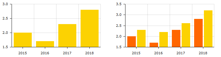
The following image shows a detail table. Both of the Bar charts below are based on that detail table. The difference between the Bar charts is caused by the number of selected data fields (one, or two). The values of the data field 'Year' are used as Category (on the x-axis).

When creating a data mapping configuration (see Data mapping workflow), it is recommended to arrange data in a detail table in such a way that it matches this 'one series per record, one bar/point per data field' approach.
Occasionally you may find that data in a detail table does not match this approach, and that it would be a better fit if the chart had one series of bars/points for each selected detail data field instead, and one bar/point for each record.
If the number of records in a detail table is consistent throughout all records, it is recommended to modify the detail table in the data mapping configuration in order to make it match the default approach.
Otherwise this requires changing the Chart script: open the Chart script, click the Expand button, and alter the code that puts data in the dataProvider property.
How to create a Pie Chart that has one slice per detail record is explained in a How-to: Put one slice per detail record in a Pie Chart.
In Connect versions up to 1.8, transposing data was possible via the Rows are series option in the Chart script wizard. As of version 2018.1, this option is no longer available.
For a list of backward compatibility issues concerning charts, please see: Business Graphics: Backward Compatibility Issues.
Enhancing a charts' design
Charts inserted with a wizard always have the same layout. The amCharts library that is integrated in Connect has loads of options to layout charts differently. Here's how to make use of those options.
Start by opening the Chart Properties dialog. Right-click the chart (in the template, or in the Outline pane) and select Chart.
Every tab menu in the Chart Properties dialog, except the last one, gives direct access to a number of layout options. For a description of the options see:
Adding and editing properties manually
The last tab menu in the Chart Properties dialog, the Source tab, reflects the choices made in the other tabs. More importantly, this tab gives you the possibility to add any amCharts configuration option that is unavailable via the other tab menus.
On the Source tab, all settings are given in JSON. For example:
{
"type": "pie",
"legend": {
	"enabled": false
},
"radius": "100",
"innerRadius": "30"
}innerRadius option, found on the Pie tab in the Pie Chart properties, gives this Pie Chart the shape of a donut.)Note that only properties that were modified via one of the tab menus are included in the JSON on the Source tab.
To change the chart, you can simply edit the JSON.
For example, adding "handDrawn": "true" (at the same level as the "type" property) will distort the lines of a Bar chart or Line chart, producing a hand-drawn effect.
All configuration options can be found in the amCharts API documentation: https://docs.amcharts.com/3/javascriptcharts/.
It depends on the class to which a property belongs, where in the JSON the property should be added. Chart properties should be added at the highest level; for example:{
"type": "serial",
"rotate": true,
...
}
Properties of the Legend (listed here: https://docs.amcharts.com/3/javascriptcharts/AmLegend) should go in the legend section in the JSON:...
"legend": {
"position": "right"
},
The Source tab also lets you change properties that are available in either the Script Wizard or other tabs of the Chart Properties dialog. You could, for example, set the colors of the bars, lines or slices by adding an array of hexadecimal color values, like this:"colors": ["#FF6600", "#FCD202", "#B0DE09", "#0D8ECF"]
Note that properties defined on the Source tab override those made in the Script Wizard or on other tabs of the Properties dialog.
For inspiration you could use amCharts' online editor: https://live.amcharts.com/new/.
Properties can be copied directly from the Code tab in the live editor to the Source tab of the Chart properties dialog in Connect.
Note that copying the entire content of the Code tab will also carry over the sample data from the live editor (the dataProvider key). These will be overwritten by the chart script in Connect.
- Properties defined on the Source tab override those made in the Script Wizard or on other tabs of the Properties dialog. The only exception is the
dataProviderproperty: this will be overwritten by the chart's script. - In Connect, the implementation was tested with Pie Charts (amPieChart) and with Bar Charts and Line Charts (amSerialChart). Other variants may or may not work.
-
Animations will not work in the output, even if the output is a web page. This is because the chart is generated on the server, not in the browser.
To get animations to work you would have to implement a solution similar to the one described in this How-to: Dynamic dashboard charts.
Using themes
The amCharts library supports working with themes. The default themes are: light, dark, black, patterns, and chalk. All except the 'patterns' theme can be used in Connect templates. Here's how to do that.
- Add the theme to the top of the JSON on the Source tab of the Chart Properties diaog. For example:
{ "theme": "light",
...
This setting overrides any color settings made in the Chart Script wizard and on the other tabs of the Chart Properties dialog. - The 'light' theme requires no other settings. For the other themes you will have to manually set the background color of the Div element that holds the chart:
- Switch to the Design mode.
- Right-click the chart area and select Box... from the contextual menu.
- On the Background tab, set the Color to:
- #282828 for the 'dark' theme and the 'chalk' theme
- #222222 for the 'black' theme
- Finally, the 'chalk' theme requires adding a remote stylesheet with this URL: 'https://fonts.googleapis.com/css?family=Covered+By+Your+Grace' to your template. See Using a remote style sheet.